 |
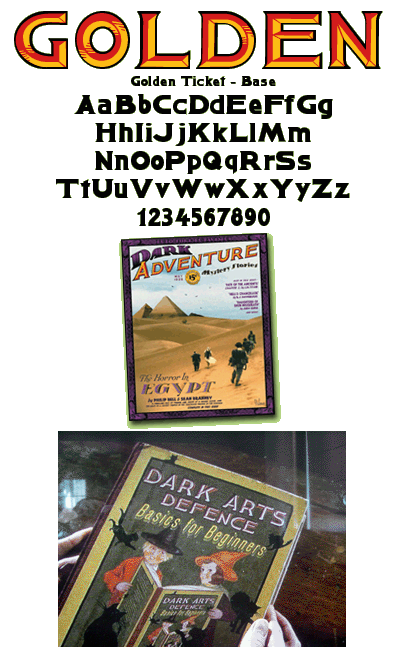
While developing a prop pulp magazine project, I had a need for numerous 1920s style display fonts. This one is based on a 1925 specimen of poster lettering by Otto Heim.
Three different weights of the font are used together in contrasting colors to create a 3D look. This is the base weight, which creates the dark outline. The font was used for the title of a prop textbook in the film Harry Potter and the Order of the Phoenix. The font is available for sale at www.myfonts.com |
|
|
For more fonts and prop documents, visit my other site.
|
||